The 1960s and ’70s saw the rise of the black light poster. And while they may have been great ways to show your love of Jimi Hendrix or the Doors, there was a subgenre of black light posters featuring subjects and iconography that, as David Ensminger writes in Art in Print, reflected a “resistance to the powers-that-be.”


That would be a long time coming, however, since natural fluorescent colors, found in glow-in-the-dark materials like amber, had been dazzling people for a very long time, explains Carolyn L. Kane in the Journal of Design History: “The bizarre and unstable behaviour of fluorescence has contributed to fluorescents’ long-held associations with magic, mysticism and the transcendental, dating from the pre-Socratics through the consumer-driven present.”
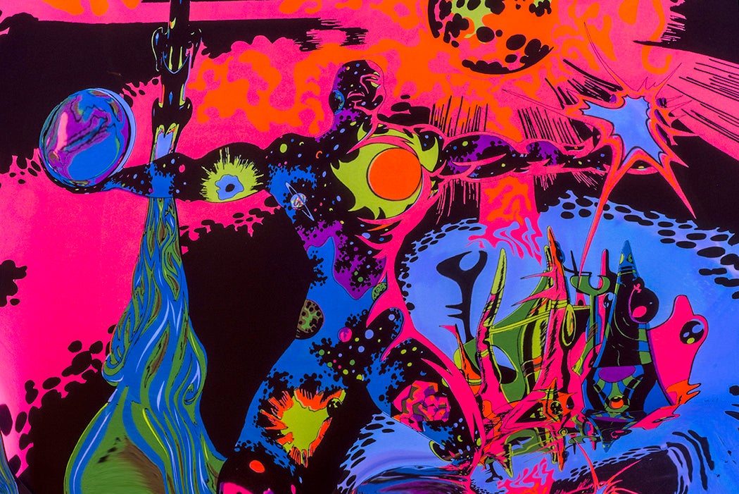
But it was the manufactured variety that really shook things up. According to Kane, “man-made fluorescents set a new premium on the mystique and aura already accrued to them.” And with the black light, an ultraviolet light that makes the bright, shimmering, fluorescent colors “pop and sizzle like no other colour can,” it was just a matter of time until art made use of the technology.
Ensminger explains that the use of black light technology exploded in the late ’60s and ’70s, becoming a huge part of pop culture. The black light poster became “closely associated with pop music and the concert culture that arose in the 1960s.” Later, one black light art company—the Houston Black Light Company—brought the experience closer to home in the early ’70s by providing everything from “astrological sex positions to repurposed folklore (‘Johnny Potseed’),” all in that glorious fluorescent glow.
The technology was part of pop culture, but it was also a part of a larger political culture of the time. The Houston Black Light Company printed posters by artist George Goode, whose illustrations included “black fantasy-warriors,” including the piece “Now! Free My Mind” (1971), which, as Ensminger writes, featured “a black man rais[ing] his unshackled fist while the background bursts with fluorescent yellow flame.”
Other posters echoing Black political iconography and sentiments followed. “Militant Miss” (1972), by George Stowe Jr., featured a woman posed with guns, while Goode’s “Rulers II” showed a Black man and woman “and a snarling panther.” These posters, featuring the “iconography of black power,” were, Ensminger explains, “a distinct subset within the mass of black light poster production.” These images were “heroic black figures independent of any white cultural context […]. Their use of fluorescence endows the figures with a sense of covert and nuanced power.”
Weekly Newsletter
"*" indicates required fields
Artists who were more strongly identified with art as activism were creating work that nodded to the black light trend. Barbara Jones-Hogu, a member of the Black art collective AfriCOBRA, used colors that “somewhat approximate[d] black light aesthetic” in her 1971 poster “Relate to Your Heritage,” as did Faith Ringgold in several of her works.
The mass-produced black light posters certainly didn’t carry the same weight as their more gallery-ready contemporaries, but they contained “an implied revolutionary spirit and African nationalism” that was found throughout the Black art world of the time.