If you’re looking for a place to get sushi tonight, there’s no doubt about what to do. You call up a map on your phone and get a top-down visual representation of where you are in the world in relation to your destination. In the nineteenth century, that way of looking at space was brand new, and fascinating to many Americans. Donald A. DeBats, a professor of American studies, writes that map companies seized on the opportunity to show people their communities from this new perspective, using marketing campaigns that stroked the egos of wealthy local citizens.


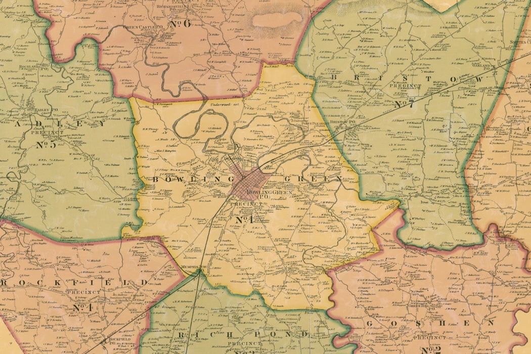
Between 1850 and 1880, cartographers roamed the country, mapping about 5,000 counties—many of them more than once. Unlike previous government-run land surveying, these projects were about producing attractive consumer products. New forms of color lithography allowed mapmakers to produce images showing not just roads, rivers, and towns but schoolhouses, churches, blacksmith shops, and even notable private homes. Besides labeling prominent families’ estates, the maps sometimes included sketches of farm owners, buildings, and livestock. In a time before balloon flights became popular, this was the first opportunity many people had to visualize their place in their community.
Map-makers’ marketing strategies built on the existing practice of peddling “mug books” featuring complementary blurbs about the local notables who paid for them. One contemporary account describes canvassers wandering the country roads with surveying tripods in the hopes of attracting a well-known citizen, “the bellwether of the flock,” to back the enterprise.
DeBats focuses specifically on a three-by-four foot map of Kentucky’s rural Garrard and Lincoln Counties, outside Lexington. It was produced in 1879 by the D.G. Beers and J. Lanagan Lithography Company. DeBats notes that it’s a very good piece of cartographical work. It details elevation contours; names creeks, ponds, and bridges; lists churches by denomination and the race of the congregation; and marks notable places, including one simply identified as “Poplar Stump.”
Weekly Digest
"*" indicates required fields
The map also offers insight into social hierarchies. Large estates were generally listed by their owners’ full name, acreage, and the name of the property. Some smaller ones included the same information—presumably because the owners paid for the privilege. Other residents were identified on the map with initials alone, while many weren’t listed at all. Not surprisingly, the least wealthy residents were least likely to be included. And, while the 1880 census indicated that the area was forty-one percent black, ninety-five percent of those named on the map were white.
DeBats notes that the hierarchies reflected on the map represent an inevitable outcome of producing an informational tool for profit. The people with money are able to make themselves visible. Similarly, that sushi place you find today on your phone may be showing up as part of a paid advertising campaign.


