We instantly and often subconsciously interpret the meaning of images every day without realizing it. Symbols and icons are visual shortcuts for a creator to communicate meaning and message to an audience. Beyond symbols, however, more complex imagery and visual relationships between an image’s various features can similarly produce meaning, though this meaning may be more open to interpretation.
In some cases, familiar subjects, contents, or contexts facilitate almost instantaneous recognition of an image’s message. When these features are less familiar, in other words when we are more distant from the original intended audience, interpretation must be a conscious choice. In this scenario, all that we’ve discussed over the last six articles—approaching works, medium, context, elements of design , principles of composition , and symbols—can be leveraged to interpret meaning and nuance through and beyond an image’s initial visual impact.
Visual analysis and interpretation can be used to approach any image, but here we examine images that are meant to communicate a particular message, not just to illustrate or adorn text.
* * *
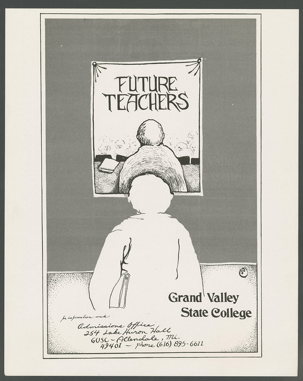
Some images are created for a narrow audience, and the creator assumes that viewers will have only casual or brief interactions with the image. This makes an image’s meaning more direct and apparent. This admissions poster from Grand Valley State College is targeting applicants for their future teachers program. It relies only on line and greyscale to communicate with the audience. Loose symbols like the book under the figures’ arm identify this person as a student. There is a clever but simple visual construct that creates meaning for the audience: as the viewer, we are placed in the position of a prospective student, looking at a poster of a current student, looking at a poster of a future teacher. This poster tells the audience that the path to being a future teacher is through this event and enrollment in the program.
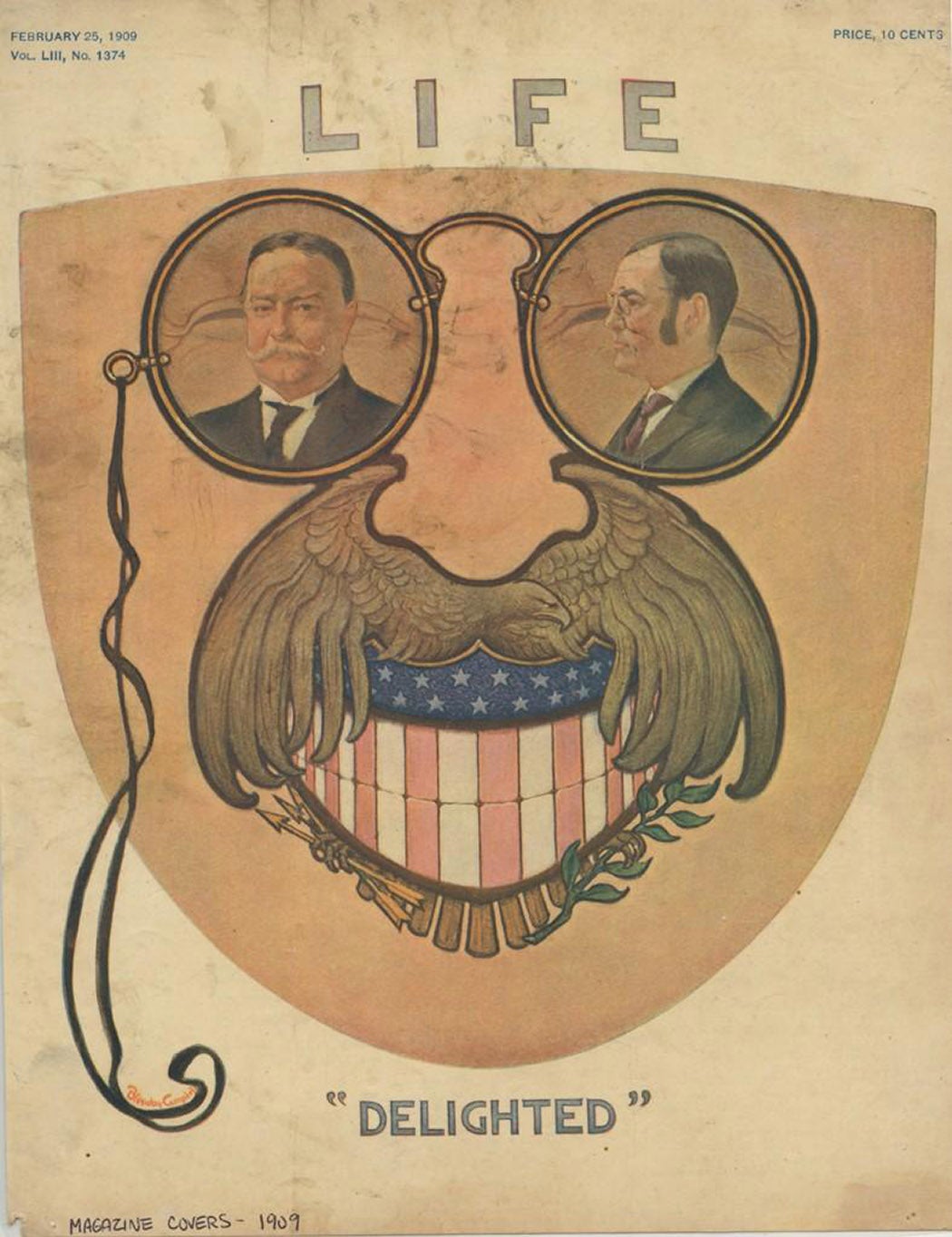
When an audience is larger, such immediate recognition of meaning often requires text and symbolism to support understanding. Attention-grabbing illustrated magazine covers are a prime example of this. Early Life magazine covers employ very different iconography and symbolism to communicate with their early 20th century audience, who would have likely made sense of the images quickly while passing a newsstand. In the first, portraits of William Howard Taft and James Sherman would have been as recognizable to the audience as Teddy Roosevelt’s signature glasses and the American symbols that create his mouth and mustache. While the message would have been clear to the magazine’s audience at the time, visual analysis of the image reveals to us the same message: after eight years as president, Roosevelt was staring down the future of America and his future out of the White House.
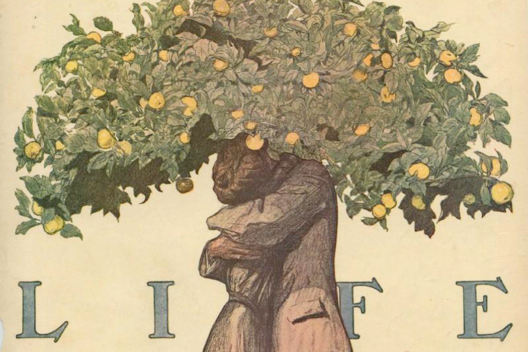
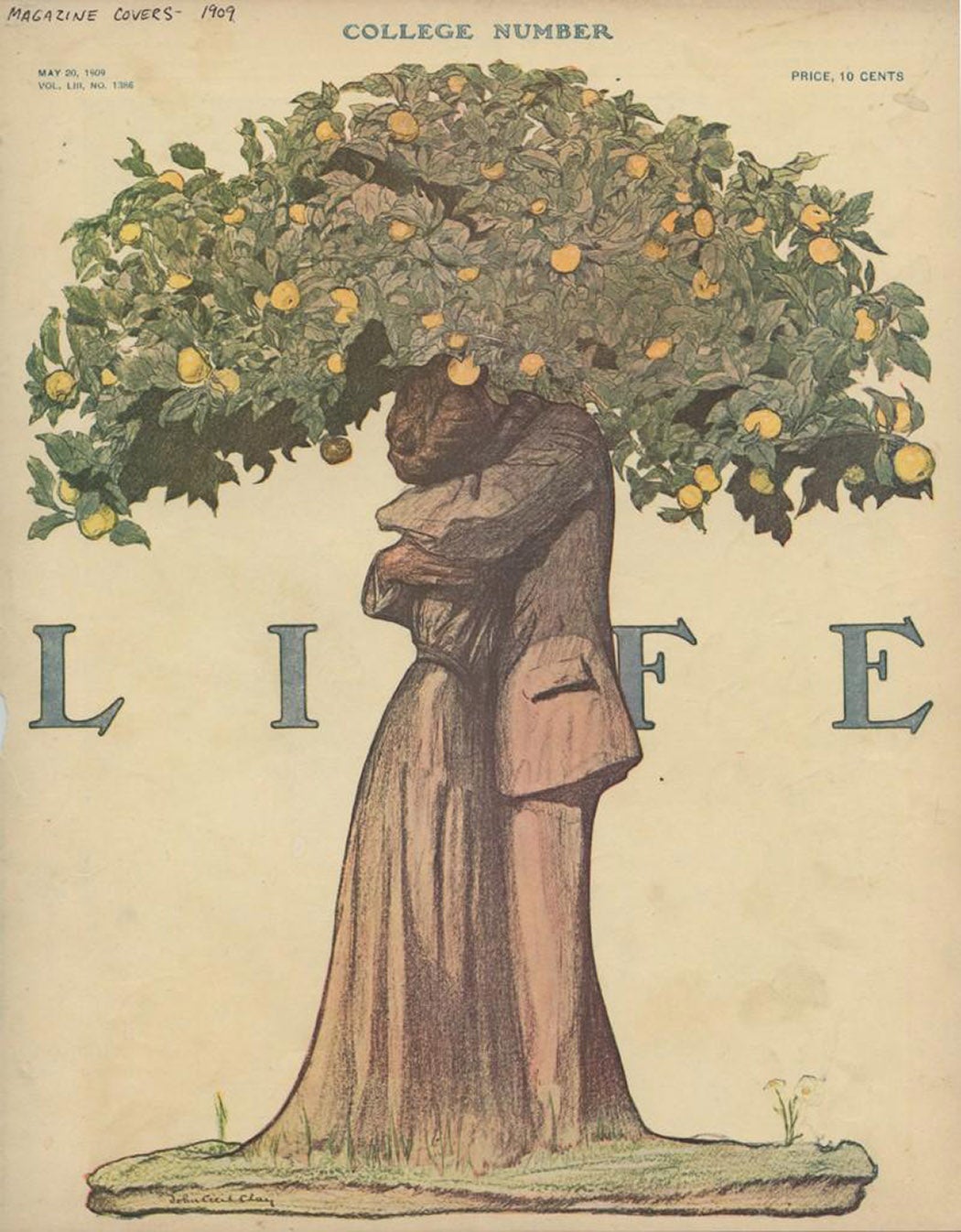
Another Life magazine cover from 1909 takes a more abstract but no less recognizable approach to communicating its message. Rather than using direct symbols, it employs broader symbolic metaphors like bountiful fruit and long-living trees to craft a scene of enduring love. The illustrator’s choice to render the figures in soft pencil shades and to obscure the figures’ faces further reinforces this image of timeless, universal love. Such an image can be widely read beyond its initially intended audience, but closer investigation of its visual components reveals the deliberate, thoughtful choices made that allow the image to resonate so easily and immediately.
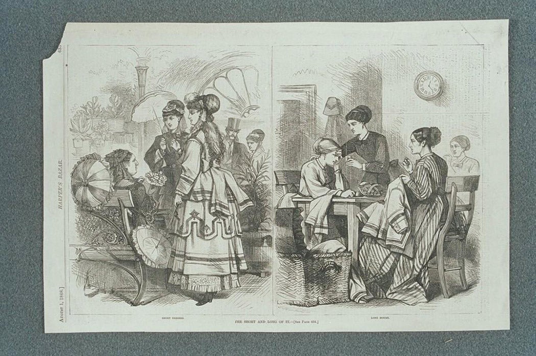
As images are initially created with a particular audience in mind, sometimes we are too removed from that audience or context to easily interpret them. Meaning is shaped by factors beyond what is initially visible. While close looking can unlock some understanding of meaning and sentiment, contextual information is often necessary when the image’s intent is less immediately accessible to us. In this illustration from Harper’s Bazar, we can get fairly close to the meaning behind the image through close looking. The arrangement of the figures in both sides of the image allows us to quickly read these as a comparison or perhaps parallel circumstances. Even with limited knowledge of Western culture, the details and flourishes that abound in the left of the image reveal that this is likely a comparison between high- and lower-class women, a juxtaposition that the figures’ activities seem to confirm.
Weekly Newsletter
Without more information, this is likely as far as most viewers would get towards understanding this image’s message. However, contextual information in the image itself gives us a big hint. The captions read: “The long and short of it”, “short dresses”, and “long hours”, alerting us to the important features of the images. Looking again, we see that the central figure on the left is, indeed, wearing a skirt that reveals her shoes while engaging in some sort of social activity, whereas the central figure on the right is wearing a skirt that pools around her ankles on the floor as she sews. Now we have a clearer understanding of this image as a commentary on the dress of women reflecting their social and occupational status.
Visual analysis and image investigation unlocks meaning in a visual work, but what if the meaning that we read into an image is not what the creator intended or what initial audiences understood? Especially with historical images, modern audiences may bring context and perspective to their analysis of visual works that the original audience did not have; their interpretation might be anachronistic.
The images we considered in this column were intended to communicate a direct and specific message, something not true of many images you might encounter in the real world. In the next column, we’ll explore how to analyze visual art and compare works’ visual components and context.
