In last month’s “Learning to Look” column we explored color, a delightfully complex element of art and design. Like shape, value, space, form, line, and texture, color is considered a structural component of visual works, a basic building block of art and design. In this week’s column, we’ll focus on how these elements are combined to create a visual impression or impact. We call these the principles of art and design or principles of composition.


The principles of composition emerged in the late nineteenth century and rose to prominence as a language to address the formal elements of early and mid-twentieth century abstract and experimental art. While the number and grouping of principles of composition vary from source to source, they include some combination of the following:
- balance
- movement
- rhythm
- emphasis
- contrast
- repetition
- proportion
(Unity is occasionally included as a principle that describes the overall harmony of a composition created by implementing other principles effectively.) By nature, these principles overlap and intertwine to form the whole of a visual composition. It’s nearly impossible to discuss one of these principles without referencing others. Let’s look at a few examples.
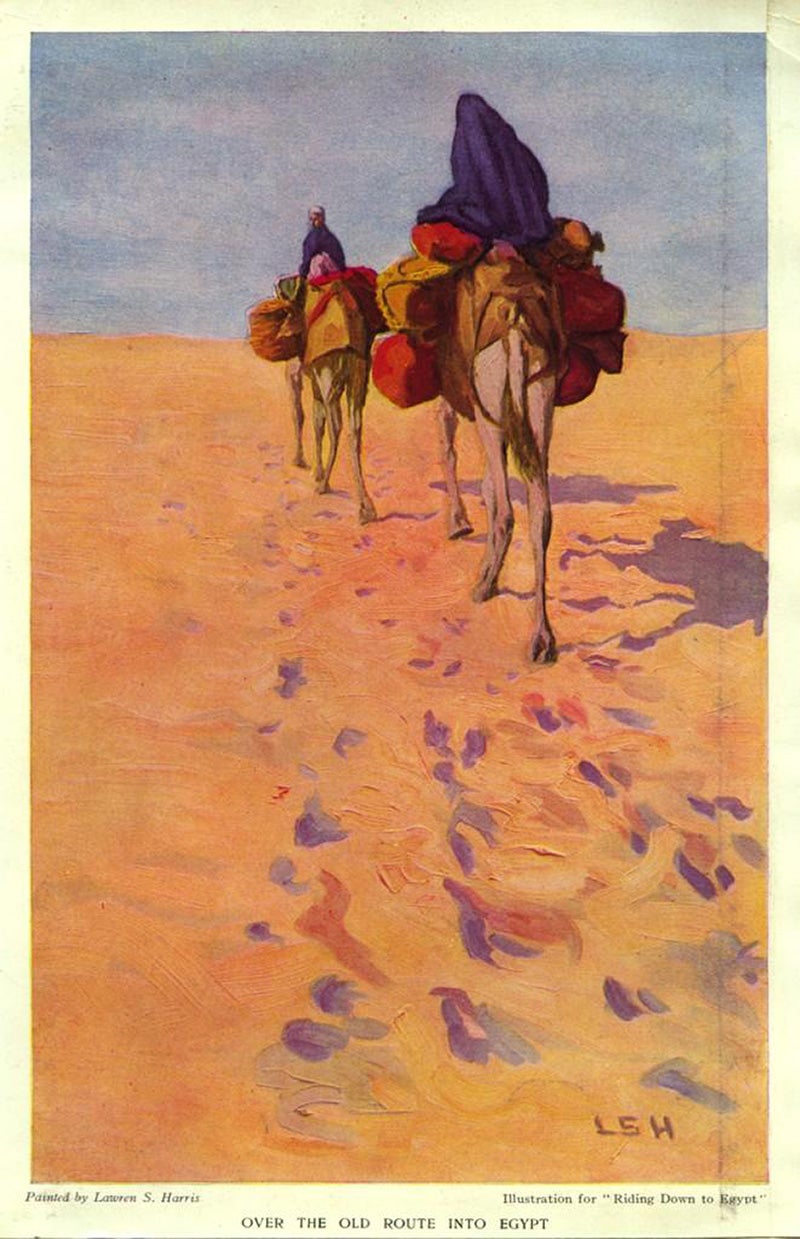
This painting by Lawren Stewart Harris (1885-1970) may be initially compelling in its imagery and the story it seems to tell. If you’ve read our discussion of color, you might notice how color helps tell the story. The violet smudges on peachy ground read quickly as evening shadows on blown sand. But these colors are working harder than that. In conjunction with other elements, such as line, texture, and shape, they don’t just tell a story of an evening ride through the desert. They tell us that it’s windy and that the figures are moving away from the viewer. Harris has used these elements to create a composition with visual interest through principles like rhythm and proportion. The proportion of the figures to each other—even the proportion of the pack animals’ hooves to the prints they’ve left in the sand—provide clarity of scale and indicate movement from the foreground into the background. The gestural marks used to suggest prints in the sand also create a sense of rhythm, the back-and-forth trudge of a journey on foot, the dance of wind across the surface of the sand brushing the prints away.
* * *
As they overlap and intersect, these principles of composition can initially be difficult to distinguish in representational images. Thankfully, artists, designers, and educators have spent considerable time creating works that illustrate these with simple, foundational elements. The Fleet Library at RISD’s collection of Arthur Loeb prints on JSTOR illustrates many of the principles of composition with basic shapes and colors using silkscreen prints produced by Loeb and his teaching assistant, Holly Alderman, while Loeb was a senior lecturer at Harvard University. As a twentieth-century leader in the field of design science, it’s fitting that Arthur Loeb (1923–2002) guide us through these design principles.
* * *
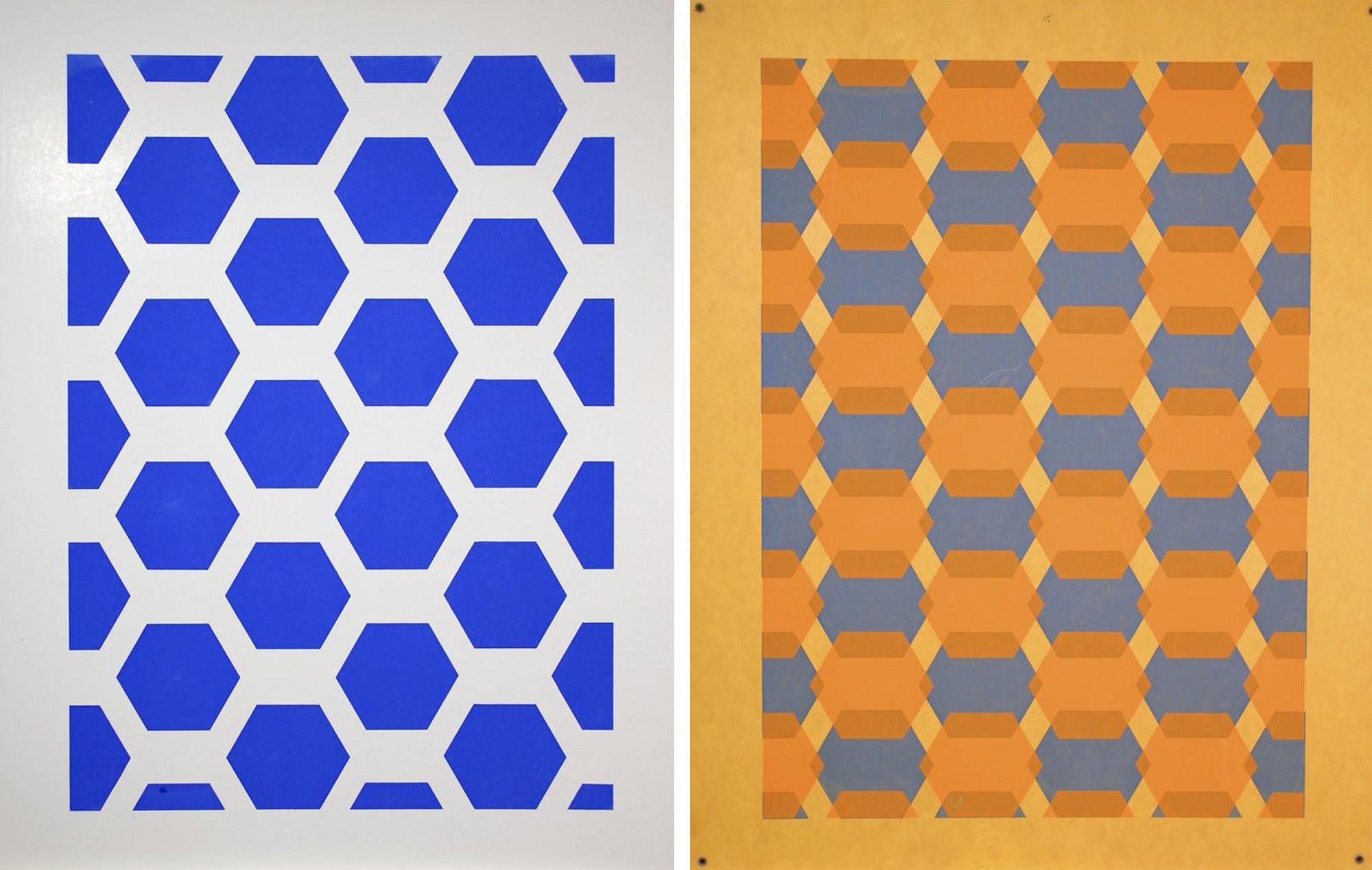
Some of Loeb’s compositions are deceptively simple, like the pattern on the left, created from a single shape repeated and spaced evenly across a rectangular board. Yet even this engages the principles of composition. Here, the hexagons are equal in size and evenly distributed across the page creating a sense of balance, however simple. The hexagons are a vibrant blue, creating clear contrast with the white board that allows us to see the shapes as completely distinct from each other and their background. The repetition of these blue hexagons creates a recognizable pattern that one can imagine extending beyond the edges of the print. Note how a composition using just one shape and one color can be described through each principle of design.
Weekly Newsletter
"*" indicates required fields
The print on the right above was likely created with the same screens used to print the blue hexagons. While it introduces a bit of complexity to the composition, it also allows us to address a key feature of the principles of composition: they are more fully understood as pairs of opposites, two ends of a scale from sameness to difference. A composition can be balanced or imbalanced. It can have high or low contrast. It can be entirely composed of repeated elements or wholly unique ones. It could suggest dynamic movement or be completely static. Comparing the blue hexagons on the left to the overlapping hexagons on the right, we can begin to see how tipping the scales can change a composition dramatically. Contrast has been lowered in the composition on the right, creating a closer relationship between the shapes and their background. The additional layer of lighter, semi-transparent hexagons seems to sit on top of the blue hexagons, creating emphasis that didn’t exist in the flat blue pattern. This layering also coaxes the eye to dance back and forth between blue, yellow, and tan, giving the shapes a sense of movement and rhythm that the first print lacks.
* * *
These concepts can be applied just as easily when artists create compositions with greater variety in their colors, shapes, and lines.
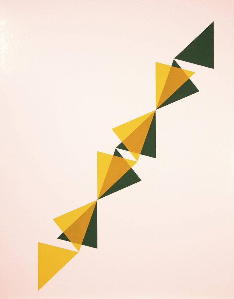
Unlike the hexagon compositions, this image is devoid of overall patterns of equal-sided polygons. Balance is created not with equally weighted objects distributed evenly across the image but with a diagonal line bisecting the background. There is a lighter layer of shapes layered over an identical set of darker shapes, but this time they do not overlap the same way from shape to shape, interrupting the repetition and creating a more syncopated rhythm.
The following print uses very similar colors, shapes, and techniques but arranges them to create a new composition that engages principles in an entirely different way than the print above.
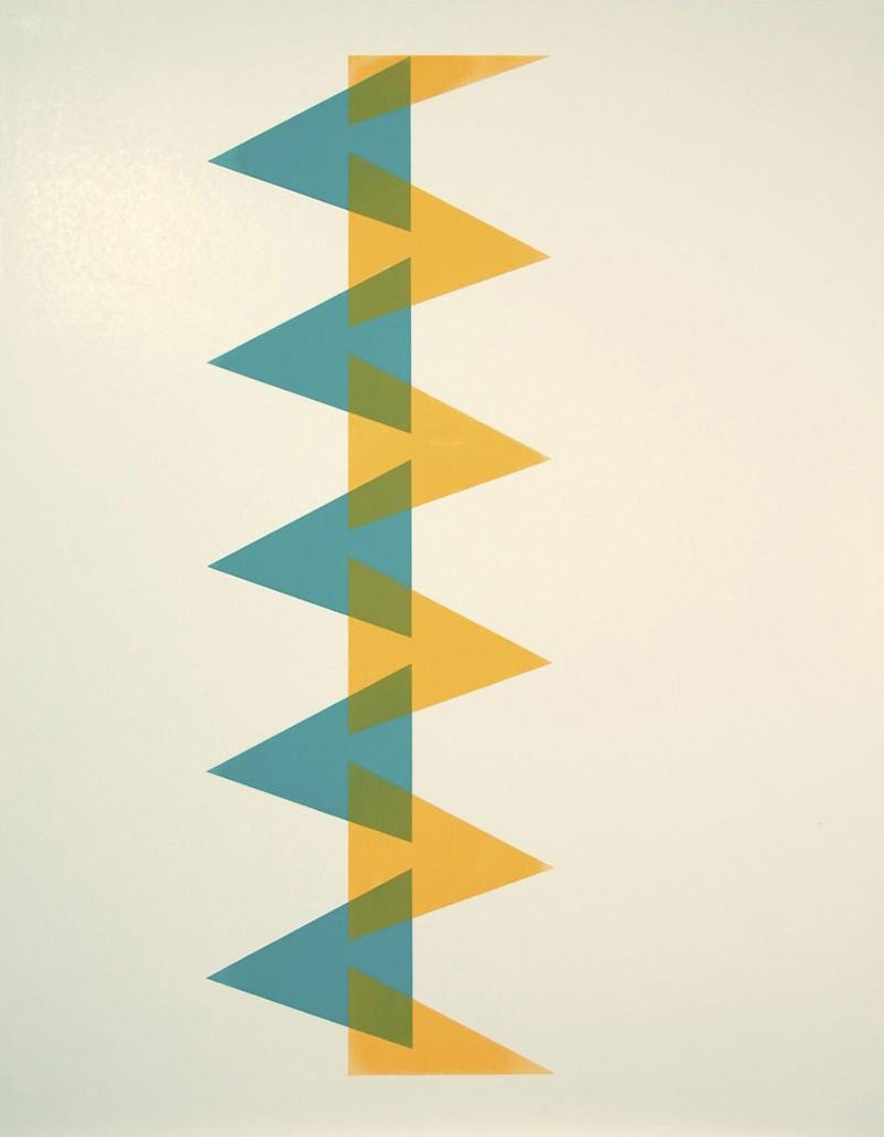
Where the balance was created in the last image by an overall diagonal line, the weight of the shapes in this image is set slightly off center to the left, and balance is disrupted. Yet the movement we saw in the previous image is stilled with more consistent repetition, and a pattern emerges. If the first image was jazz, this one is a march.
* * *
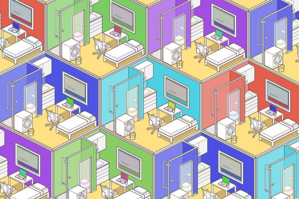
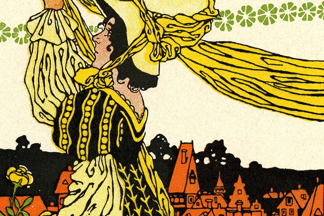
Having seen how these principles come together to form abstract compositions through shapes and colors, consider the following image. This is a more complex composition than the Loeb prints, but the principles apply in the same ways.
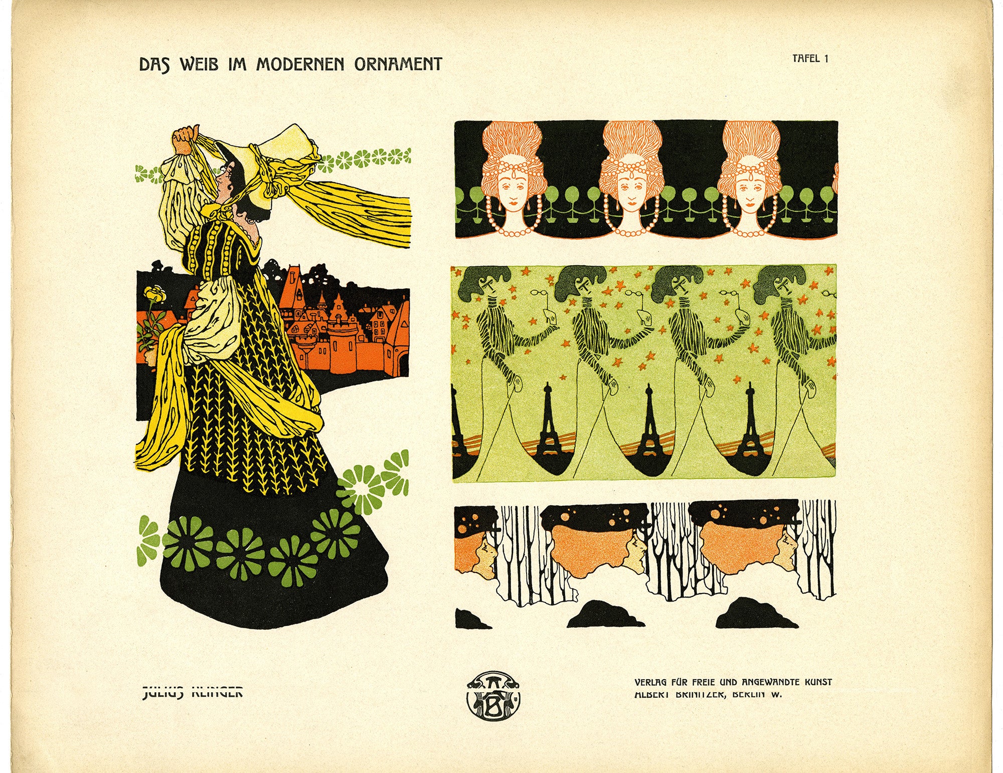
Shapes, colors, and lines are still arranged to give a sense of pattern, contrast, balance, and more, though now the shapes are recognizable as people and objects. In the largest, leftmost image, see how the repetition and placement of the green flower-like shapes create a sense of rhythm. The size of the small buildings compared to the larger figure puts emphasis on the person and creates a sense of proportion. Balance, movement, and repetition also factor into this image—on your own, consider how. Examine, too, the pattern samples to the right. How are these principles employed differently to take what is essentially the same motif—woman, object, woman, object—and transform it into unique compositions?
Are you an educator? Explore composition and design with your students using this lesson plan:
KEYWORDS: principles of composition, repetition, balance, movement, proportion, rhythm