On the news sites of 2020, whether the topic is COVID-19 infections, police shootings, or unemployment rates, you’re very likely to find a data visualization. From simple graphs and maps to wild tangles of moving multicolored lines, pictures help us absorb mathematical information about our world. One key innovator in data visualizations was none other than Florence Nightingale.


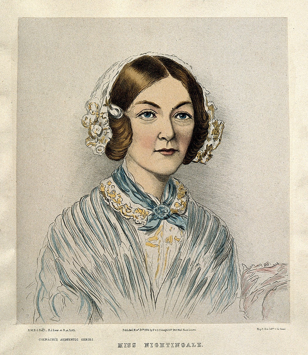
We typically think of Nightingale as the woman who revolutionized the profession of nursing while selflessly caring for sick and injured soldiers. But, as statistician Christine Annette Franklin writes, Nightingale was also a talented mathematician. In her twenties, she taught math to young children. She was particularly fascinated with statistics and probability. An intensely religious person, she once said that “to understand God’s thoughts we must study statistics, for these are the measure of His purpose.”
Nightingale was far from the first person to map out numbers in visual ways, as Michael Friendly explains. Between 1786 and 1801, William Playfair invented several of the ways of looking at numbers that are still used today: the line graph, bar chart, pie chart, and circle graph. Over the next few decades the use of data visualizations grew. That was thanks partly to advances in lithography and mechanical calculation.
Also, Friendly writes, there was just more data available. Increasingly, European nations collected information not just on imports, exports, and population but also on things like education levels, causes of deaths, crimes, marriages, and births. In the 1820s, Baron Charles Dupin created the first modern statistical map. It used shading to convey the educational instruction offered in different parts of France, showing a dramatic shift between the north and south of the nation.
Nightingale’s innovation was less about technique than about her purpose. While overseeing nurses in Turkey during the Crimean War in 1854, Franklin writes, Nightingale was horrified by unsanitary conditions and a lack of medical supplies. In February 1855, the mortality rate at the military hospitals she worked in hit 42 percent. She began a campaign to improve conditions, financing much of it with her own money.
Nightingale also gathered data. She recorded how soldiers had died—whether from contagious disease, wounds, or other causes. To win support for her efforts from England, she arranged the information she found using line graphs, scatterplots, and other graphic devices. She used color to emphasize particular aspects of the data.
Weekly Newsletter
"*" indicates required fields
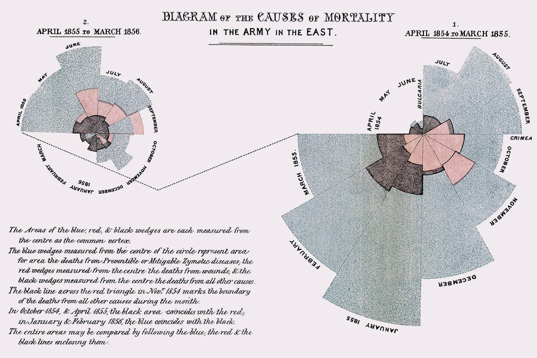
Most famously, Nightingale used a visualization called a polar-area diagram. The diagram shows the causes of mortality in the military hospital. It demonstrates how deaths from preventable disease outweighed combat fatalities enormously in 1854 and early 1855, and how the changes she put into place managed to greatly reduce those deaths by April 1855.
“The graphic message hits you between the eyes,” Friendly writes.
Today, of course, that’s precisely the reason that colorful, clear visualizations aimed at a popular audience are everywhere.

