They both have origins in Queens, born of offbeat tinkerers whose impact would, after difficult starts and plenty of setbacks, far exceed the wildest imaginations of their inventors. Here, one might think, is where the story arcs of the copy machine and punk cease to overlap. On the one hand, Chester Carlson’s 1938 invention of xerography in an Astoria kitchen begat the photocopier, a machine whose ubiquity in corporate settings and innate emphasis on sameness made it virtually synonymous with the soulless drudgery of twentieth-century office life. As for punk, the irreverent, anti-establishment attitude concocted in the early 1970s by, among others, the four Queens natives who formed the Ramones, continues to assert itself today as the negative image of corporate culture.


But, as with many things that appear diametrically opposed, there’s more to it than that. Cornell University’s vast collection of toner-rich, xerographically produced punk flyers, spanning five decades and two continents, provides an object lesson on anti-art in the age of mechanical reproduction, illustrating the dependence of punk proliferation on corporate innovation—and the raw power unleashed by seizing the means of (office paperwork) production.
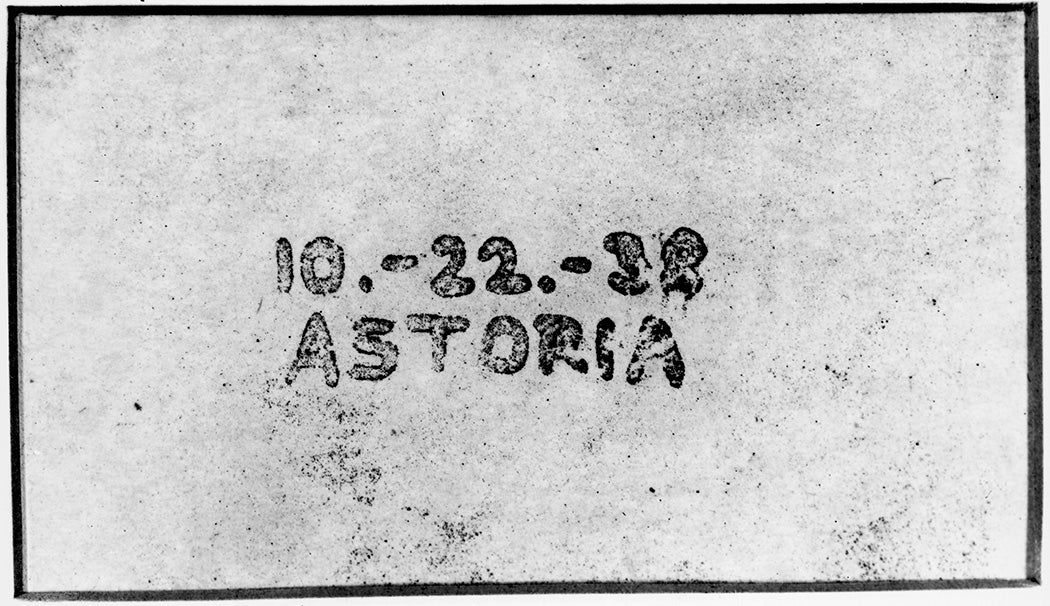
According to the lore, the story of Xerox started “in a second-floor kitchen above a bar in Astoria, Queens” amid “clumsy equipment that produced considerable smoke and stench.” It was here that Chester Carlson, a young patent office employee, spent his nights trying to invent a “dry” office copy machine, combining photography with electrostatic printing to produce identical images without liquid chemicals. His breakthrough came on October 22, 1938, when he managed to transfer a simple, handwritten inscription of the date and place—“10.-22.-38 ASTORIA”—from one piece of paper to another, a preemptive echo of the date/time/location scrawls on countless punk flyers to come. There are other, atmospheric commonalities too: from the squalid, nocturnal setting to the noxious odors and subpar gear, the ambience of the Xerox origin story shares an array of signifiers later associated with the grungy clubs and D.I.Y. culture of punk.
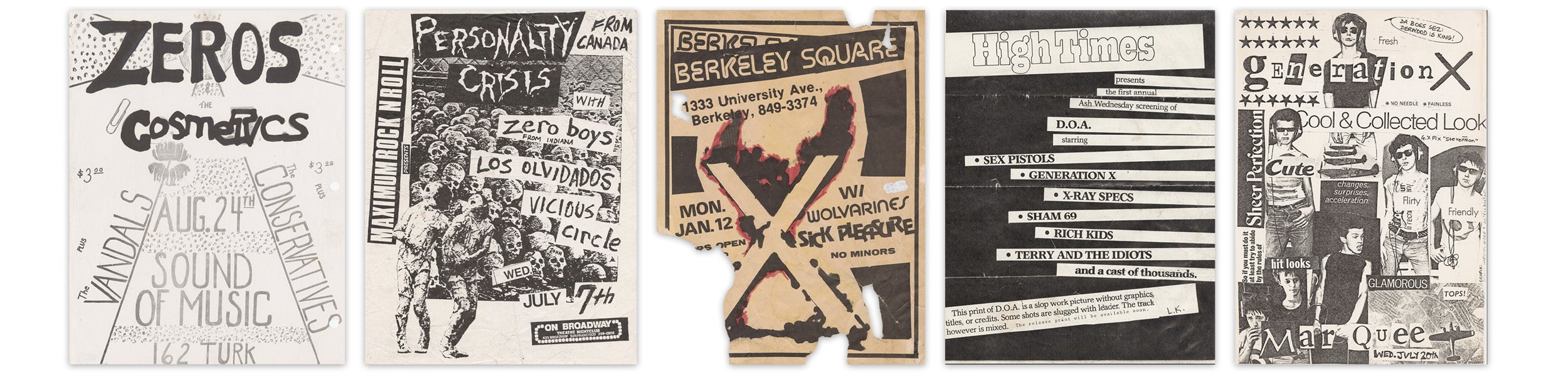
Much as punk bands tended, decades later, to toil for years in obscurity before their logos became mall t-shirt mainstays, it took time for Carlson’s invention to gain traction. A full decade elapsed before the name “xerography” (meaning “dry writing”) was coined and the trademark “XeroX” adopted by the Haloid Photographic Company. The flourish of the capitalized second “X” was eventually dropped, as it demanded an attention to aesthetic detail that was lost on the marketplace. But, when the company dropped “Haloid” altogether to become simply “Xerox” in 1958, consultants anticipated problems from the slightly less stylized name as well, fearing it would sound too much like “zero,” which would surely turn off investors. Of course, these concerns turned out to be moot, and the term has since become so fully integrated into English as to become an accepted verb. But here, too, there’s a sort of aesthetic anticipation at the heart of the Xerox story, as, two decades later, the punk landscape would be awash with zeros (e.g., the Zeros, the Zero Boys) and X’s (e.g., X, X-Ray Spex, Generation X), responses to and appropriations of the empty and anonymous consumer landscape that Xerox helped establish.
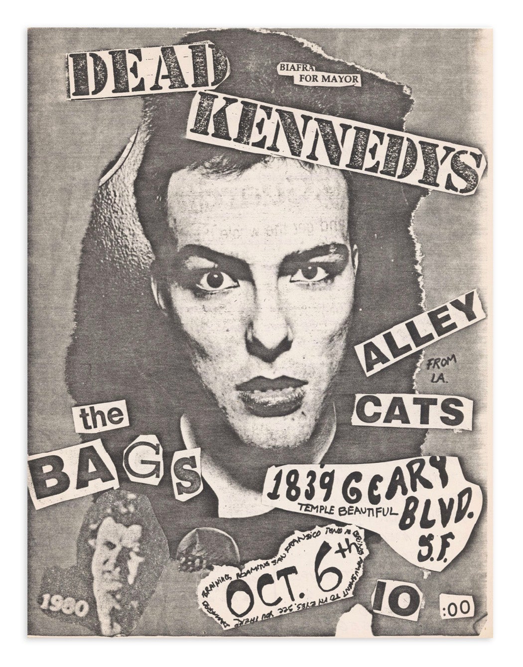
In 1959, Xerox at last struck gold with the introduction of the 914 model, the first (and, for many years, the only) automatic plain paper copier. Early ad campaigns emphasized the time- and cost-saving implications, but they also gestured to the democratizing nature of the new machine—no training or special materials required, just ordinary people and ordinary paper. One 1962 ad featured crisp print on a brown paper bag, not unlike the ones later worn as masks on-stage by the Los Angeles punk band the Bags, and a fine symbol of the disposable, consumer culture on which punk commented. Then, in 1963, Xerox ran a two-page ad featuring two identical, framed drawings with copy reading:
We bought a famous Picasso picture. We took it out of the frame. Made a copy of it on our Xerox 914. Then we put the original back in its frame and also framed the copy. We photographed both of them. And here they are. Can you tell which is which? Are you sure?
The point, of course, is that it’s impossible to see a difference. As the media scholar Hannah Frank observes, the ad seems to make two nearly contradictory claims here: first, asserting the essential sameness of a Picasso and a piece of office paperwork, as demonstrated by the machine’s dutiful duplication of each with equal precision; and, second, suggesting the Xerox needn’t just be used for text, but also for images—and in fact offers promise as an artistic medium.
Nearly from the beginning of its time in the spotlight, then, Xerox seemed to be daring people to détourn its machine at the same time and in the same words as it catered to its corporate clientele. There’s a rich history of consumer products deviating wildly over time from their original intended use: the phonograph, for example, was intended for office dictation but is now remembered primarily as a home entertainment device. And indeed, by the late 1960s major artists were making good on the 914’s suggestion of creative promise, using it to explore pop art themes of speed and mass production (Andy Warhol had a Xerox machine installed in the Factory in 1969), and contribute to boundary-testing conceptual art with the Xerox Book, a landmark collection of process pieces by Sol Lewitt, Carl Andre, and others.
But the artistic lineage of the punk poster, as it emerged in the early 1970s, was rooted in the politicized art of the Situationist International, which opposed the totalizing field of consumption by reclaiming and remixing its elements to produce new meaning. The emphasis was on the act—the creation of a “situation”—not on the expertise or pedigree of the artist. Punk bands themselves formed with a similar, strategic de-emphasis on skill and celebrity, a point iconically illustrated by a page of a 1970s photocopied fanzine, showing diagrams of three chords alongside the words: “This is a chord. This is another. This is a third. Now form a band.”
It’s only natural, then, that the representational and promotional aesthetic of punk would take the same approach. East Bay Ray, guitarist for San Francisco’s legendary Dead Kennedys neatly ties these points together, as quoted by the writer David Ensminger:
There was a feeling that you didn’t need any special training to create a project if you had a good idea to express… One of these outlets was for a band member or a friend to create a different poster for each performance. It didn’t matter whether a punker had art training or not—DIY, “do it yourself,” was in the air… Objets d’art were being made with very little capital.
Just as the 914 ads had insisted, all you needed was ordinary people and ordinary paper. And, of course, a Xerox machine.
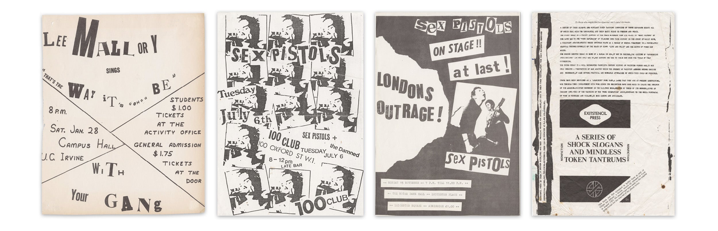
The overlap between punk and Situationism was neither wholly accidental nor entirely intentional, and the average punk artist, whether visual or musical, was often not as unschooled, as the myth would have it. Later, much would be made of this, especially surrounding punk impresario Malcolm McClaren’s claims to have manufactured the Sex Pistols as part of an elaborate scheme to rip off major music labels. McClaren, an art school dropout, was associated with the 1960s English Situationist group King Mob. Around the same time, he met fellow art student and future Sex Pistols art director Jamie Reid, who contributed graphics to the seminal 1974 Situationist anthology Leaving the Twentieth Century.
Together, McClaren and Reid had a knack for translating elements of existing subcultural styles into an immediately identifiable package of image and ideology, and transmitting it with incredible efficiency and effectiveness. For example, while the “ransom note” style of typography certainly preceded Reid, it was he who made it a part of the punk aesthetic package. As for McClaren, his verbosity and knack for finding a platform meant punk had a media mouthpiece providing instant interpretation. Indeed, regarding punk posters, Ensminger quotes McClaren as proclaiming them “a declaration of war against art” that “screamed ugliness all across town—designs made to address an army of disaffected youth. These were the rats’ ears of the city fighting the consumerist ideology of the mainstream.”
While the surviving members of the Sex Pistols have made clear that McClaren was pulling fewer puppet strings than he pretended, he wasn’t the only one stocking the ideological arsenal for up-and-coming punks to draw from. Punks were doing it themselves, too, turning out an endless array of photocopied fanzines full of their own articulations. Through a series of self-produced zines, fellow Brits and Sex Pistols contemporaries Crass worked assiduously to combat media simplifications and create a coherent punk narrative. In one 1982 publication, they promise “insight into much of the thinking of the ‘punk generation’ which, contrary to the media portrayal of punk as mindless and violent, is both caring and articulate.” In the same issue, they also provide a “manual on how . . . the victims of ‘oppressive institutions’ can not only get by, but subvert and use to their own ends the tools of that oppression.”
Whether through the media manipulation of McClaren or the Xeroxed pages of zines, there was no shortage of pre-packaged ideological supplies for founding a punk band—and, of course, no shortage of “tools of that oppression” ready be subverted.
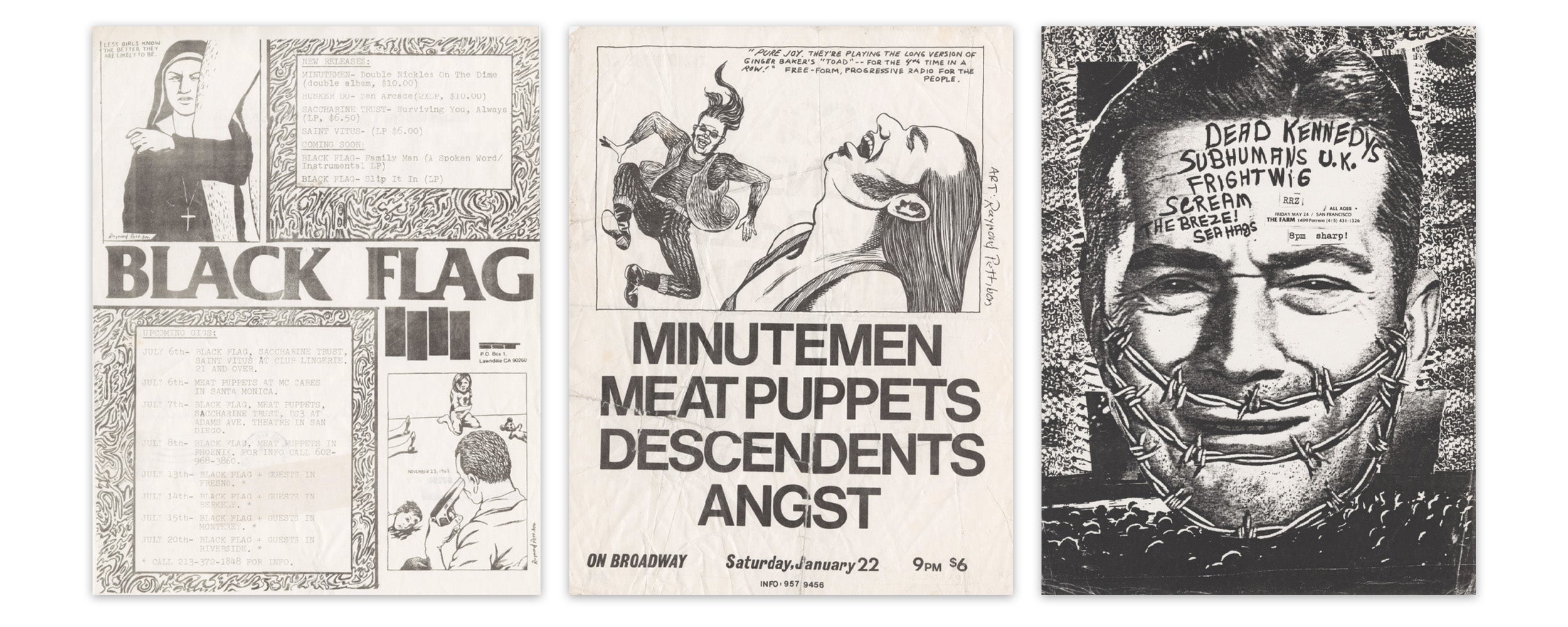
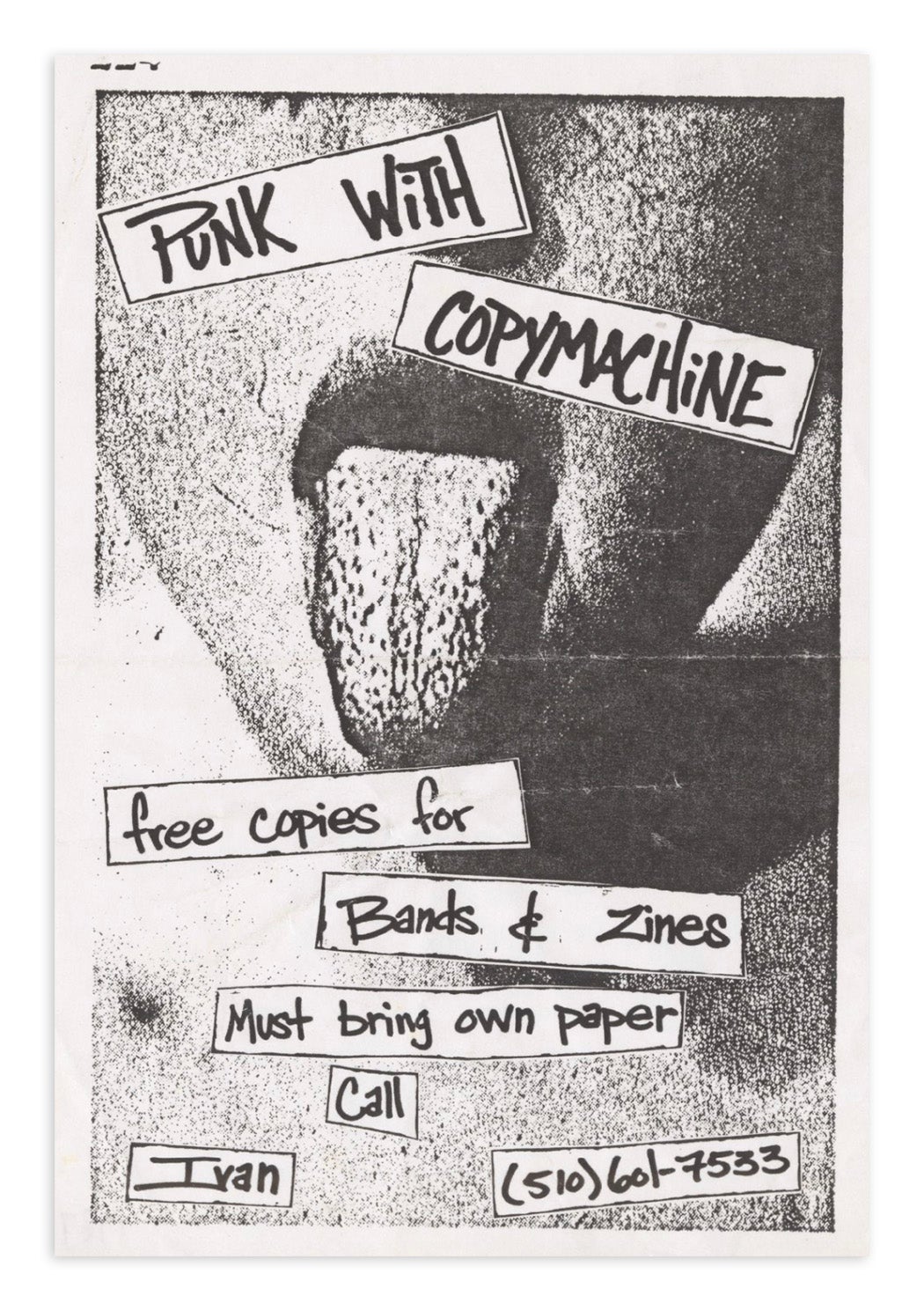
Aside from a Xerox machine, the key materials needed for a punk rock flyer tended to include: newspapers and magazines from which text and images could be ripped and reassembled; pens with which dates, times, and illustrations could be scrawled; and glue to assemble the collage that would be flattened into a photocopy. In addition to appropriating existing imagery, some emerging punk artists created their own, playing with the visual vernacular in the form of cartoons and drawings. Raymond Pettibon, perhaps best known for creating the barcode-like Black Flag logo, created photocopy-ready pen and ink illustrations, taking formal cues from traditional comics but infusing his images with subversive themes, dialogue, and settings. Others, like Winston Smith, who created much of the Dead Kennedys’ most recognizable artwork, collaged already lo-fi newspaper imagery into disturbing juxtapositions of advertised versus actual life. When run through the photocopier, toner smears and other imperfections made these images literally darker, producing an oddly nocturnal final copy that perfectly reflected the milieu and mood of punk.
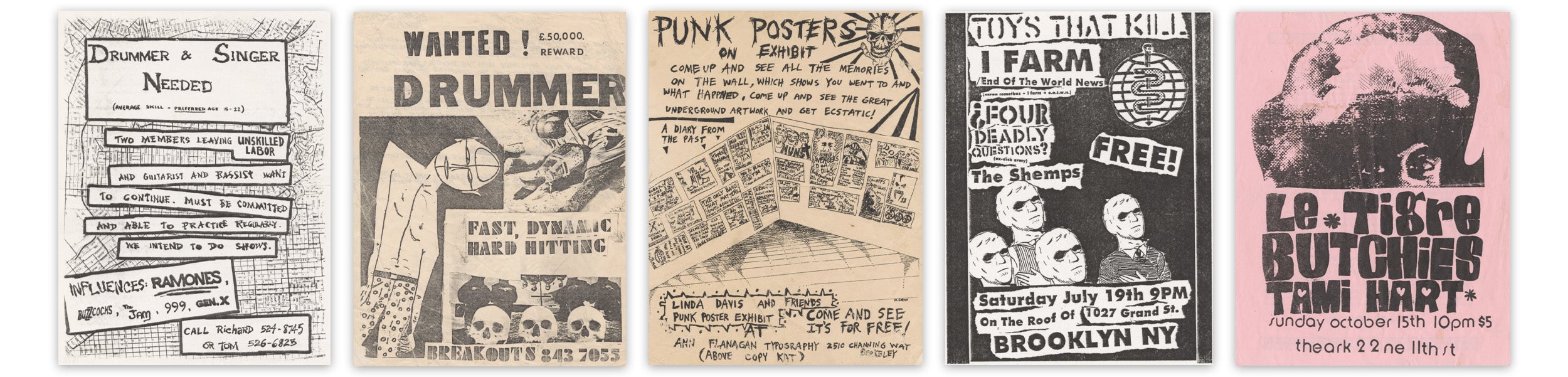
Punk, and the Xerox art that promoted it, critiqued a culture that prized conformity, where everything was a copy of everything else. But it didn’t take long for it, too, to become derivative. Alongside show flyers and zines, Cornell‘s punk flyers collection contains a number of signs seeking other musicians to form a band. Stylistically identical to the gig posters, many also include the names of existing punk bands that the fledgling band wants to sound like, with one even carefully re-creating the logos of the existing bands. This sort of intentional, straightforward duplication without further commentary or anything in particular to add seems to take things full circle: back to the Xerox ideal of the perfect copy. Another flyer from 1984–85 announces a punk poster exhibit. Already, punk was becoming encased in amber, and the flyers that had once evoked the immediacy of a moment (that is, of a gig and its sociopolitical surroundings) had been removed from their original critical context to become graphic fetishes.
Weekly Newsletter
"*" indicates required fields
The Cornell collection contains punk flyers dating through the first decade of the twenty first century, well after advanced graphic software and high-fidelity color printing became more or less readily available. It was no longer necessary for underground bands to communicate through and self-promote using cheap photocopies. And yet, the aesthetic remains, and kids continue to start bands intended to critique mediocrity. Perhaps this is because the world Xerox made is still our world, and so the machine that made the twentieth century—or at least made the most paperwork in the twentieth century—remains the most appropriate medium for its own critique.