In the world of art and design, the name of William Morris is synonymous with florid, coyly whimsical designs for wallpapers and textiles teeming with sinuous vines, cheeky birds, and other bold natural motifs. The faintly antique yet timeless designs have garnered something of a cult following, such that we can adorn our cottagecore homes with Morris-wrapped soap, Morris calendars, Morris coloring books, or follow Twitter accounts that tweet every Morris design or track Morris designs on TV shows. This past November, housewares brand Williams-Sonoma even launched a line of utensils, crockery, and linens drawing on Morris & Co. archives to much fanfare, one of many collaborations Morris & Co. has undertaken in recent years that keep Morris’s designs in circulation.
William Morris—who spent many years of the late nineteenth century as a socialist organizer—dedicated the final years of his life to the Kelmscott Press, which published fine editions of romances, poetry, and translations, hand-pressed with typefaces and decorations designed by Morris. Longtime editor of the Modern Art journal J. M. Bowles, writing in 1894, described the press as “the latest expression of his [Morris’s] genius for decoration.”
Other contemporaries were not quite as enthused: George Bernard Shaw found the press’s output lacking political and moral substance, and English historian and socialist E. P. Thompson saw the press as Morris “allow[ing] himself to indulge in his pleasures” after having “given the best of his mind and energy to the Cause.” Later, scholars and critics attempted recover the political dimension of what had previously been written off as the retired designer’s indulgent lark. Norman Kelvin, editor of four volumes of Morris’s letters, described the Kelmscott editions as concrete expressions of Morris’s “commitment to the aesthetic as the true life of the senses that socialism promises to fulfill.”
This second phase of reading granted Kelmscott’s lush editions—which included the writings of Ruskin, Shelley, Chaucer, and even Morris himself—more gravity than the earliest detractors had, but, according to literature scholar Aaron Donachuk, still overlooked the inherently political nature of every component of the volumes’ production process, down to the Morris-designed typefaces, custom paper, and ink dyes likely sourced by Morris himself. These practices could well be categorized among Morris’s other revivalist techniques and maximalist aesthetic, but viewed in the context of the history of book printing and typography, the highly unified and regulated look of each Kelmscott book was, Donachuk argues, a reading experience carefully crafted to confront the rapid pace of late Victorian industrialization and capitalism.

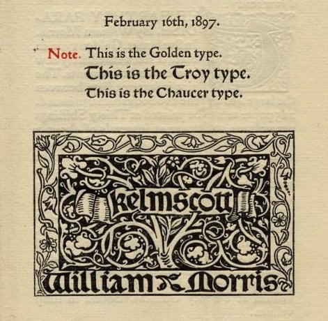
The three typefaces designed by Morris and employed by the press—Golden, Chaucer, and Troy—drew on the designs of fifteenth-century Venetian printers and medieval manuscript lettering. Morris’s adaptations of the traditional forms were not only aesthetic but also political statements of function and efficiency. Late Victorian type designers had “straightjacketed the letter into an appearance of geometrical consistency and uniformity,” writes Donachuk, with razor-thin hairlines (the thinnest stroke of a typeface, such as the upper and lower curves of the letter “b”) and thick rectangular stems. Modernizing printers posited that the slimmer, more regular typefaces (such as Bodoni) were easier to read and could be printed more densely—namely, more efficient for both reader and printer in an increasingly industrialized and profit-driven society.
Printers such as Emery Walker and Theodore Low DeVinne (both influenced Morris and the press) argued that the highly uniform modern typefaces actually affected the opposite: the spindly letterforms impelled printers to add spaces around words and lines to ensure legibility, negating any economy of space. The strong, parallel vertical lines of modern typefaces produced a blurring effect across a dense page of text—quaintly called “dazzle”—that Morris explicitly disavowed.

“I began printing books with the hope of producing some which would have a definite claim to beauty, while at the same time they should be easy to read and should not dazzle the eye,” Morris wrote in the mission statement of the press. Thus his choice of the more beautiful and more readable traditional typefaces was a “confrontational posture, unwilling to give up the field of speed and efficiency to the capitalist mode,” argues Donachuk.
Weekly Newsletter
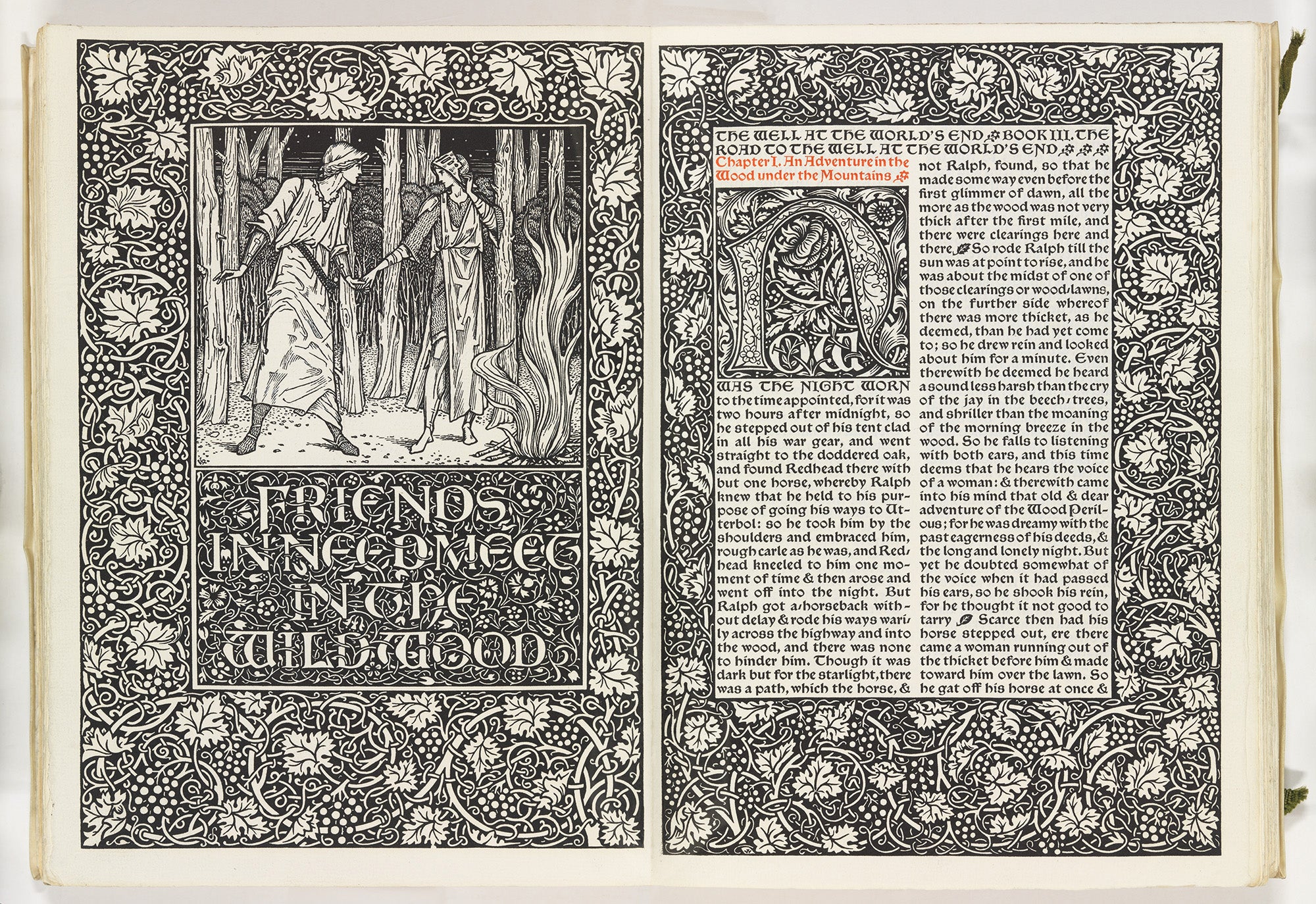
Kelmscott Press volumes took another cue from medieval manuscripts in the very composition of the page, eschewing “rivers and pools of white space” created by paragraph breaks and unjustified margins. Text in Kelmscott books is justified on the right margin, and paragraph breaks are typically denoted by a Kelmscott leaf ornament. The “close-set and distinctively dark and saturated appearance of the Klemscott page” is perhaps not easily readable in a general sense, but Donachuk argues that these practices in fact make the labor and process of printing apparent on the surface of the page, particularly in moments of deviation. An unjustified line, omitted leaf ornament, or polysyllabic word broken across a line break, as occurs not infrequently in Kelmscott’s relatively diminutive volumes (compared to their early modern ancestors), indicates a compositor’s deliberate choice to deviate from the norm. Surveying a page dotted with the leaf ornament or the right-hand margin of the text block thus creates “a network of surficial reference points,” as Donachuk calls it, where the reader can trace the compositor’s decisions at every line.
The chiseled typeface, densely illuminated margins, and foliage-dotted text of a Kelmscott page create a richly decorated surface that evokes the past but is inherently the product of a community of creative agents. This mode of reading “encourages us to look at how other [fin-de-siècle] artists drew on technical discourses to make politico-aesthetic action legible on the surface of the text or artwork,” writes Donachuk—perhaps a key component of the enduring charm of Morris’s work.


