In 2017, Gerald McGoey, a Canadian businessman, declared personal bankruptcy. The personal bankruptcy filing came years after his Ontario-based telecommunications company had gone belly up. McGoey wanted to keep his stately vacation properties—a lakeside cottage in the Muskoka region of Ontario and a hobby farm—and produced documents showing that both were held in trust for his children.
Something seemed amiss. The lawyers called in Thomas Phinney, who has dubbed himself The Font Detective. “A font can tell you a lot of things, depending on the circumstances,” the Portland-based typography expert told me. Phinney is also the CEO of FontLab, which offers font creation software.
Weekly Digest
Phinney quickly found a way to call McGoey out. The document putting the cottage in trust was allegedly signed and dated in 1995. But it was printed in Cambria, a Microsoft serif font that came out to the public in 2007. Phinney also saw that the document regarding the farm was written in sans serif Calibri, which also saw widespread release in 2007. But the document supposedly was dated and signed in 2004. Even if, by strange happenstance, McGoey had buddies at Microsoft and got access to the font while it was still in development, designers changed Calibri’s numbers in 2005. His document included the newer version of the digits.
The judge’s decision against McGoey specifically mentioned typography evidence. “It was perhaps the biggest single thing, but not the only thing,” says Phinney. “In many cases, the font is not the only thing happening.”
Phinney gets called in for cases involving contested documents, sometimes testifying in court when lawyers suspect something is up because of other suspicious evidence. In the McGoey case, there was actually no other paperwork related to the trusts. Plus there were other discrepancies, such as the fact that McGoey and his wife used the vacation properties all the time and paid for everything, while their kids paid nothing. And only one of the kids had ever heard about the trusts.
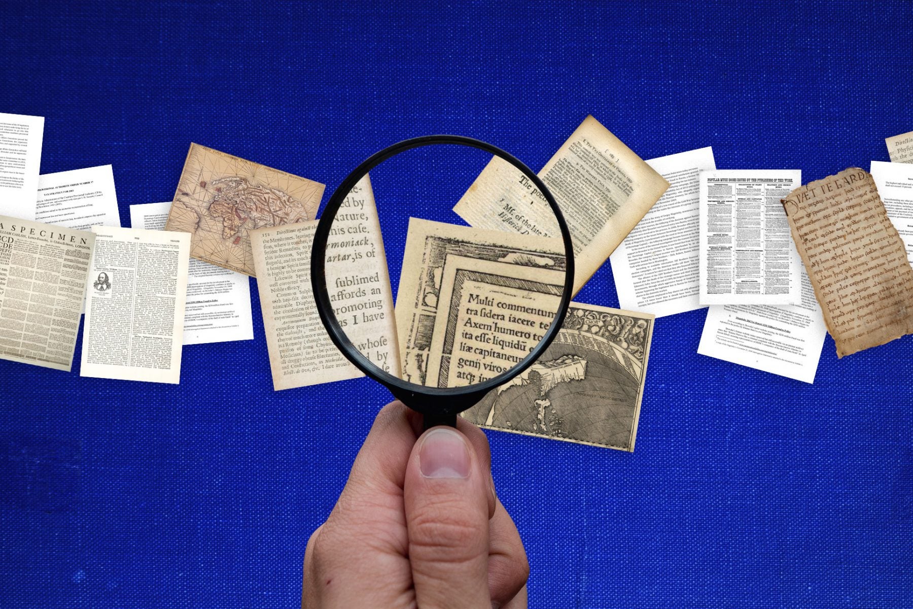
Few people in North America have Phinney’s expertise around font identification and investigation and get called into groups. But a select group of people who do historical authentication often scrutinize fonts too. Typography can tell enough of a story to help date an artifact or determine if it’s authentic.
But even in this realm, font detectives are rare. “Few and far between are the persons whose eyes are trained enough in historical traditions to assess the appropriateness of a type style,” writes Johanna Drucker in the 2006 journal article “Graphical Readings and the Visual Aesthetics of Textuality.” “Who but a typophile eager to demonstrate expertise cares if a text is set in a face that was invented after that text was written, or three hundred years before it was imagined or according to a sensibility utterly inimical to that for which it is used?” she ponders.
In 1999, when a lawyer approached staff at Adobe with a questionable document, only Phinney, who was working at Adobe as a manager at the time, was keen to look at it. “Nobody else on the team had any interest, which confused the heck out of me,” he recalls. That first case launched his new sideline, a profession for which he has few colleagues.

Typophiles allow objects to tell stories beyond the printed words they contain. Drucker argues that “graphical codes [are] the very site and substance of historical meaning, rich and redolent with genealogical traces of origin and use, trailing their vestiges of experience in the counters and serifs of their fine faces.”
Phinney uses his years of experience in the font business—he also has an MSc in typography and printing—to assess the legitimacy of modern documents. Similarly, historians use their knowledge of the history of the printing press and of the lives and skills of long-ago typographers to assess the legitimacy of artifacts.
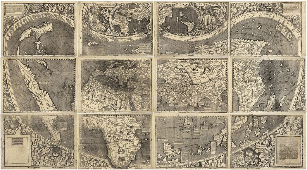
The 1507 Waldseemüller world map, for instance, is notable for its complexity and detail. It contains the first known mention of America on a map. Just 1,000 were ever made, and the one surviving copy went on display at the Smithsonian in 1983. “The map presents a mystery irresistible to puzzle-solvers. We know the cartographer, but not who printed it, where or when,” writes Elizabeth Harris in the 1985 article “The Waldseemüller World Map: A Typographic Appraisal.” The map was authenticated in 1901 by a Jesuit scholar who compared it to copies.
In Harris’s quest to understand the multi-page map, she charts the five typefaces used on it, tries to ascertain which printer might have owned all or most of them, and susses out later additions of words to the map. She examines font anomalies such as an “oblique stroke that serves as a comma” and information about the other projects and habits of printers in Strassburg, Germany, at the time. From all this, she concludes that the two main sections of the map were printed at the same time, and notes that many labels on the map were printed later, in at least 1515.

Font size can also tell a story with real-life consequences. In the literary scholar Douglas A. Brooks’ 1998 article in Studies in English Literature, he tracks the typography of Shakespeare’s byline. The playwright was credited on a printed play for the first time in 1598, but his name appears “in small type near the middle of the title page.” That insinuates that he merely corrected and augmented that text.
Shakespeare’s name gets printed in larger fonts and with increasing clarity as the years pass—a 1600 play actually says “written by.” A 1608 title page for King Lear “announces rather loudly that here is an author and here is a play, and the correspondence between them is a typographically emphatic genitive.” Contemporaneously, the playwright became more and more of a public figure, Brooks’ theorizes. He cites the French philosopher Michel Foucault’s claim that when works began to have authors, those authors became subject to punishment.
Around this time, Shakespeare changed the name of one of his most famous characters, Falstaff, from Sir John Oldcastle. This name would have served as a satire of a nobleman of the time. Brooks believes there’s a connection to the playwright becoming an identifiable public figure:
It seems extremely significant that the Oldcastle/Falstaff problem, which has generated a number of critical questions that go to the heart of authorial intention, is so closely linked to Shakespeare’s typographic emergence as an author. Indeed, the printing history of Shakespeare’s texts provides us with a remarkable convergence of the material evidence of his status as an author with the metaphysical grounds of authorship itself.
Font detectives—and scholars like Brooks might be considered among them—look at history and circumstances, but they base it all around core skills in identifying fonts, quirks and all. Phinney is at times asked to testify in court as to which font has been used in a given document. Sure, many font nerds or fans of the documentary Helvetica can identify Times or Arial. Phinney can actually persuade a judge by talking about “the shape of the bowl on a two-story a” or “the outside legs of the m.” (Phinney knows the shape of fonts down to the smallest curve: he’s invented two fonts himself, Hypatia Sans and Cristoforo.)
In one case, the appearance of an unusual-looking dollar sign helped Phinney call out another sham document brought into play during a divorce. It outlined a private mortgage on a family farm, the interest on the debt for which magically equalled the increased value of the land, so the soon-to-be ex-wife would get nothing. That, and the fact that there were no payments ever made on this loan, caused the lawyers to suspect fraud and call in Phinney.
While the document was dated and signed in the 1980s, the quality of the printout was too good. Inspection of the original showed that it had been printed on a 600 dot-per-inch laser printer, which did not come into office use until the 1990s. Phinney also knew that certain printers had certain font drivers with quirks around certain characters. A funky dollar sign, in particular, helped him to identify the specific HP printer model that printed out the phony document. In fact, the husband’s lawyer actually owned the same model.
Phinney is becoming increasingly busy with this work, getting as many as four cases a month. He’s building relationships with document examiners, most of whom specialize in handwriting and signatures. “None of them specialized in fonts,” he says. People sitting down to craft sham documents or whip up faux historical manuscripts should think, and think hard, before they print.


