Some album covers are simply iconic. The working-zipper cover of the Rolling Stones’ Sticky Fingers, the gatefold cover of Miles Davis’s Bitches Brew (which opens up a psychedelic world), or the Beatles strolling in line on Abbey Road. Album covers can tell the story of the music before the first note is heard. But this wasn’t always the case.
Album covers used to be much less colorful, much less artistic. They were, as art critic Peter Frank writes, “brown paper envelopes sandwiched between dull, respectful leatherette covers.” But once Alex Steinweiss came along, things began to change. According to Frank, Steinweiss “effectively invented” this new art form, and we haven’t looked back since.
Steinweiss was a designer who came to Columbia Records in 1939. He was influenced in part by the bold design styles of the Works Progress Administration posters of the Great Depression and the Bauhaus movement, as well as his love of music. He wanted his designs to reflect the feel of the music, “as if illustrating the liner notes or even the sounds themselves,” Frank explains.

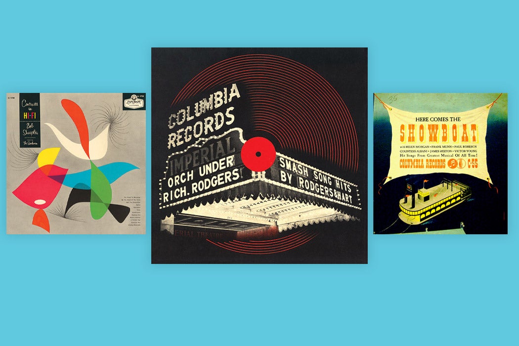
This meant saying goodbye to the functional but plain covers of the past and welcoming in new, eye-catching patterns and images. His first design for Columbia was Smash Song Hits by Rodgers & Hart, which featured the songwriters’ names in lights on a shimmering marquee. The design was a risky one for Columbia, Frank explains, because even though plain covers were boring, they were certainly cheaper, and Steinweiss’s inventive new design would raise production costs. But the gamble worked, and “a whole genre was greenlighted.”
Before leaving Columbia to design posters for the war effort, Steinweiss created visually striking covers for music ranging from Bessie Smith to Brahms’s Second Symphony, all in what Frank describes as “the fluid language of mid-century modernism.” Steinweiss even created and copyrighted his own font, “a flouncy, rococo ‘Steinweiss Scrawl.’” He later designed covers for Decca-London labels under the name Piedra Blanca, and, under his real name, for the Everest label, which allowed him to experiment even more because of its small size.
Weekly Newsletter
Of course, album covers don’t have the same impact they once had, as music is less tactile than it was in Steinweiss’s day, Back then, album covers were the artwork of the everyday, well-designed objects that anyone could pick up at a store. In the digital age, record covers are, as librarian Susan E. Thomas points out, more of an intentional art form, with artists realizing and exploring “the ‘objectness’ of their music releases,” so much so that Thomas argues that records belong in art libraries rather than music library collections.
Record covers represent the marriage of design and music, and through the years, their impact has been given more weight. They were a marketing tactic that produced great art, the “subject of loving contemplation and near fetishization by audiophiles and genre enthusiasts,” Frank writes. And Steinweiss was one of the reasons this became the case: “he could hear with his eye what his ear saw.”


