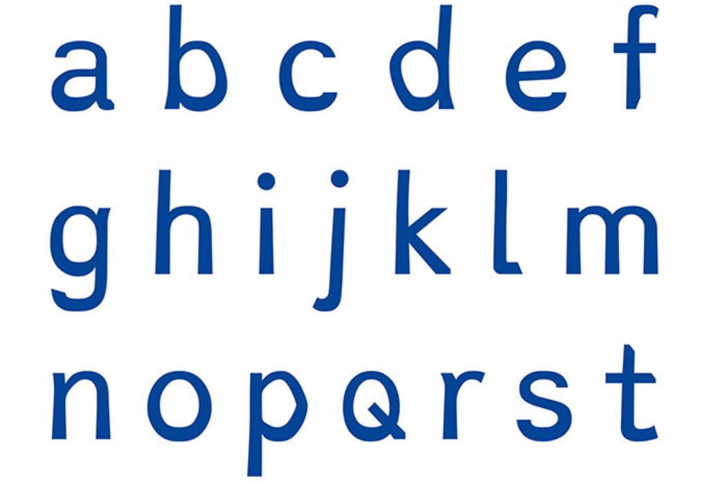
A dyslexic Dutch designer has created a special typeface to help dyslexic readers.
Dyslexie, which is one of the most talked-about projects in the ongoing Istanbul Design Biennial, is the brainchild of 33-year old Christian Boer, who began designing the typeface as a senior project at Utrecht University.


Traditional typefaces are confusing for readers with dyslexia because “twin” letters like b and d are based on the same design. In Dyxlexie, slight variations in similar letters—along with more space between individual letters—help readers keep text straight. The computerized Dyslexie font is dark blue color by default, which Boer says is easier for dyslexics to read.
The desktop version of the Dyslexie typeface works with Apple and Microsoft systems and is offered free to home users. (Schools and publishers pay a fee.)
What the heck is a typeface, and how is it different from a “font”? For a highly-readable discussion of how type design affects us as readers and writers, check out Royal van Horn’s 2004 essay “Typefaces” in The Phi Delta Kappan.
For a more clinical discussion that resonates with Boer’s theory, read “The Effect of Typography upon the Perceptual Span in Reading“. In their paper, Donald G. Paterson and Miles Tinker investigate how changes in typeface can significantly impact on the peripheral vision of readers—all readers, not only ones with dyslexia. Their conclusion: “Certain typographical arrangements reduce the speed of reading…. In general, it may be concluded that typographic variation frequently is an important determinant of perceptual span.”
In other words, typography indeed affects the fluidity of reading. It may be a funny-looking typeface, but maybe we could all read more efficiently with Dyslexie.


