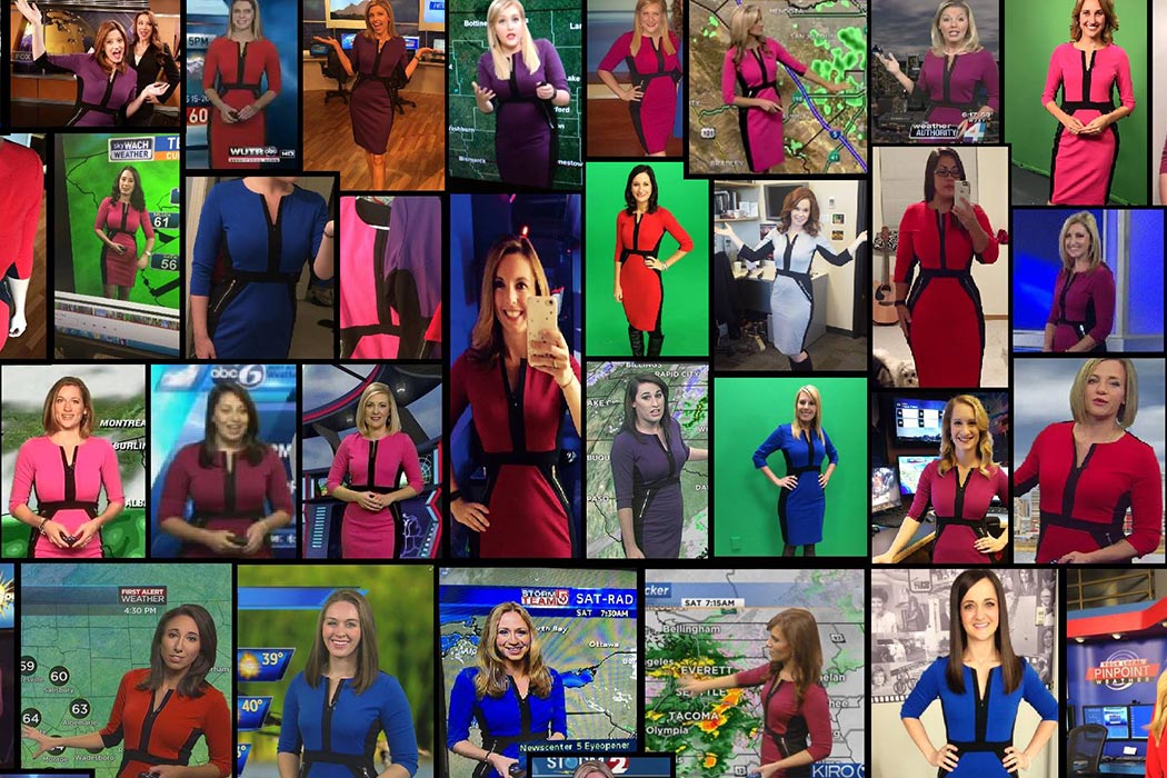
There’s a trend sweeping the evening news: A popular dress that can be found on hundreds of meteorologists throughout the country. After being posted on a Facebook page for weather women, the dress went viral—and has sparked a conversation about the fashion choices of news reporters. Your local weather channel reporter may have a high chance of wearing the now-familiar dress, but what do the aesthetics of TV news mean? How did the news look in the past? Jenny Tobias explores TV news as an expression of modernism.

Tobias found a similarity between TV journalism and modern design. By relying on transparency and technology, she wrote, both media embrace ideals of speed, simplicity, and truth. It isn’t surprising, then, that the visual language of TV newscasts should embody modernity.
TV news has changed a lot since transmissions began in the 1930s. Early newscasts simply featured people reading bulletins over the air—and they borrowed heavily from existing news formats like radio broadcasts and newsreels. Tobias wrote that the expansion and increasing sophistication of television news brought designers and graphic artists into the mix to keep viewers’ attention while illustrating the news of the day.
Tobias tracked the norm of showing the upper body, a desk, and a graphic to the 1940s, when the “news desk” was first invented. Title cards gave broadcasts urgency and structure. Over time, TV news rooms were invented, featuring a mix of home-like objects such as mantels and office furniture. Broadcasters often appeared in faux studies, where they smoked cigarettes and browsed books. Details like maps and nameplates “suggested an executive’s office or even a war room,” giving broadcasters authority over both the material and the medium.
Eventually, modern technology brought the “control room” into vogue. By being able to switch to live, remote locations, reporters had even more technological prowess. Control rooms “expos[ed] the editorial and technical apparatus” of the news, she wrote. Moreover, they incorporated aspects of modern design such as buttons, spare wood, and windows that “used a modernist vocabulary to reveal the apparatus and signify ‘straight’ journalism as well as news-as-entertainment.”
The location of the newscast wasn’t the only thing that became modern: So did the graphics that accompanied the reports. By the late 1970s, computer graphics were in vogue, allowing newscasts to brand the news and make subtle editorial statements.
And that’s where it comes around to the modern aesthetic of the weather woman. Tobias tracked the evolution of the weather map from store-bought map of the United States to high-tech, modern graphics that cast the meteorologist in a scientific, authoritative light. “In techno-weather,” Tobias argues, “no matter how strong the weather caster’s personality, he or she is now enveloped by the technology and lives in a fully digital climate.” Perhaps the dress is just another part of that evolving, modern game—a visual marker that tells viewers about the careful thought and planning that goes into a weather woman’s wardrobe and forecast.